Chart In Focus
What Hindenburg Omens and an Oil Crash Mean
McClellan Financial Publications, Inc
Posted Dec 15, 2014

December 11, 2014
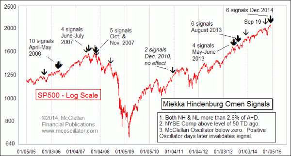
The two big financial news items in December have been the multiple Hindenburg Omen signals and the crash in crude oil prices. I recently went on CNBC to talk about the former. Its relationship to the latter is inescapable.
A Hindenburg Omen occurs when the number New Highs and New Lows on the NYSE both exceed a specified percentage of total issues. See this article for more details. There are other requirements, such as that the NYSE Comp be in an uptrend, and the McClellan Oscillator needs to be negative. Those other criteria are important, because there is no sense getting an omen when you are already in a downtrend, or when the market is too strong to be able to go down. This month we have seen the New Lows list expanding, thanks to the poor performance of multiple issues with the words “resources”, “energy”, or “drilling” in the companies’ names.
So does it really count if the New Lows list is populated mostly by members of a single sector?
That is a really great question, and we are going to see the answer provided over the next several weeks. My assumption is that things would be a lot worse if it were financial stocks instead of energy stocks that were populating the new lows list, since financial stocks are farther up the food chain and thus a more problematic indicator if they start to turn unhealthy.
Still, the Hindenburg Omen has a well-earned reputation for signaling trouble ahead of every major decline. Its problem is that it has also signaled trouble at times that did not lead to calamity, leading to a separate reputation as a wolf-caller indicator. But as the late Jim Miekka liked to point out, an omen is not the same thing as a guarantee of trouble. It is a sign that something is hinky, but not necessarily a sure harbinger of additional trouble. And the more signals that one sees in a short time frame, the more certainty it can offer about trouble to come.
For these latest Hindenburg Omen signals to really bring trouble, they are going to have to fight against positive seasonality, strong breadth numbers, and the positive implications of the 3rd year of a presidential term. Those are a formidable set of forces to have to oppose.
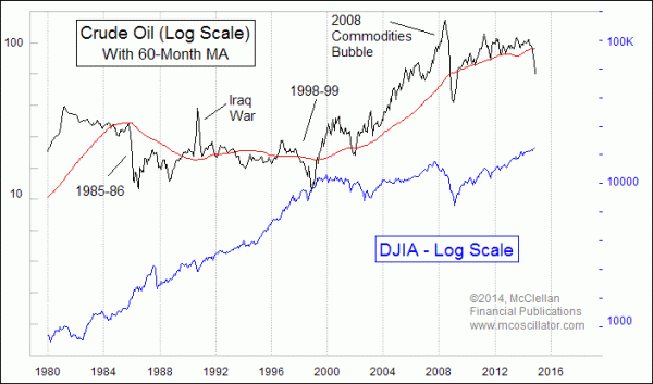
So what does it really mean for the market when oil prices have a big decline? Let’s take a look at history to see what it can tell us. Over the past 4 decades, there have been 4 really big price declines before this latest one:

I would set aside the first Iraq War in 1990-91 and the 2008 Commodities Bubble as separate types of events. The declines in each of those cases originated from unnatural spike highs.
But the declines in 1985-86 and in 1998-99 originated from a flat price structure for oil prices, which was more like the decline we are seeing right now. In each of those prior two cases, the result was fairly bullish for the stock market, notwithstanding a 2-month dip in 1998 that was attributed to Ralph Acampora turning bearish on CNBC in August 1998. So the current oil price decline is more like those two instances.
Many analysts are likening the oil price drop to a big tax cut, with an associated stimulative economic effect. But how much?
According to the Energy Information Agency the U.S. consumed 126 billion gallons of gasoline during the 12 months ending Sep, 2014. So given the drop in RBOB gasoline futures from the top at ~$3.10 in June to $1.64 today, that $1.46 difference would amount to $183 billion over 12 months. That’s just gasoline, and it assumes that today’s price sticks for the long run. It does not include other factors that affect actual prices which consumers pay at the pump.
But if we consider that gasoline is just one of the uses for crude oil, then the savings magnify. According to the EIA data on crude oil consumption, annual U.S. consumption of crude oil during the latest 12 months was 6.9 billion barrels. So the price drop from ~$107/barrel at the June 2014 high to ~$59 today represents a total presumptive savings of $332 billion per year, assuming prices stay exactly here, and that consumption does not change. That is well short of the $85 billion per month that the Fed was doing during the peak of the latest round of QE, but it is not nothing.
So while the FOMC has ended QE, the global crude oil market has presented us with its own form of stimulative easing. Ironically, history shows that the oil market can yank back its own QE faster than the Fed seems to be able to.
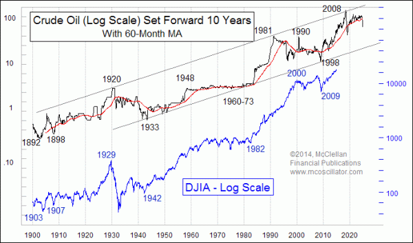
From another standpoint, the current oil price decline does indeed have terribly bearish implications for the stock market… for 10 years from now. There is a 10-year leading indication relationship between oil prices and the stock market, as shown in this chart:

The current oil price slide says that sometime around 2024, we can expect to observe some type of “echo” in stock prices from this year’s oil price drop. I am not sure why this relationship exists in this way, with stock prices echoing oil price movements with a 10-year lag. But after seeing that it has “worked” for over 100 years, at some point we can say that there is enough evidence to accept it, even if we cannot explain it.
For now, the message of this leading indication is that the oil price rally from 1998 to 2008 has yet to see the full extent of its echo during the 2009-2018 period. While the current dip in oil prices is going to be bad for stock prices about 10 years from now, it is not really a problem for stock prices in real time. So any worries that investors express over this oil price decline represent an opportunity for us to take advantage of irrational fears over the oil price collapse.
***
Related Charts
###
Dec 11, 2014
Tom McClellan
Editor, The
McClellan Market Report
email: tom@mcoscillator.com
website: www.mcoscillator.com
(253) 581-4889
Subscribe to Tom McClellan's free weekly Chart In Focus email.
Copyright ©1996-2014, McClellan Financial Publications. All Rights Reserved.
321gold
Ltd

|


