Chart In Focus
Santa Claus’ Report Card Is In McClellan Financial Publications, Inc
Posted Jan 7, 2019 
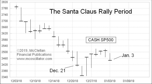
January 4, 2019 “If Santa Claus should fail to call, the bears may come to Broad and Wall.” That’s the old saying in the financial markets, referring to the “Santa Claus Rally” period which consists of the last 5 trading days of the year plus the first two of the next year. Yale Hirsch first took on the task of quantifying this in his Stock Traders’ Almanac, and in his book, “Don’t Sell Stocks On Monday”. The basic idea is that this period is usually an up one for the stock market, and my own research shows that it is up 78% of the time since 1928. But if it goes against that usual bullish tendency, it is supposedly a bearish omen for the year to follow. This year, we find that the official Santa Claus Rally period did see the SP500 close up by 1.29%, and so that should mean an up year for 2019, if the omen is correct. [NOTE: An earlier posting of this article had that 1.29% figure incorrect.] But let’s take a look at the statistics, just so we can know how much faith to put into this omen. 
What the table shows is that the random probability of an up year has been increasing over time. And so has the Santa Claus Rally period’s ability to correctly predict a coming up year. But for an omen to be worth anything, it has to beat the random chance of an event, and this is where this particular omen comes up wanting. Looking at the data more closely we find that an up period in the Santa Claus Rally period is an okay omen for an up year to follow, beating the random probability just barely. But if the Santa Claus Rally period is down, that’s what is supposed to foretell trouble in the year to follow, and this is where this particular omen comes up wanting. Since 1980, a down period for the Santa Claus Rally period has only been correct 36% of the time in forecasting a down year to follow. Here is a look at this relationship on a scatterplot chart: 
If the Santa Claus Rally period omen was correct all of the time, then we would see a uniform arrangement of the dots from lower left to upper right. The lower left quadrant is what the omen is really all about, referring to the times when the market is down in late December and how that is supposed to foretell a down year to come. But instead we find a lot more dots in the upper left quadrant, meaning that there were down periods for the Santa Claus Rally period which were followed by up moves the next year for the SP500. In other words, it does not really live up to its billing as a bearish omen. BUT!!! It is a pretty good bullish omen when that period sees a gain. An upward move during the Santa Claus Rally period has a slightly better than random track record of foretelling an up year to follow. I should emphasize slightly. It would be great if we could have formulaic tendencies which predict the future, and even better if they would rhyme. Humans have a proven tendency to believe statements more if they rhyme. That is why traders believe in Wall Street sayings like “Sell in May and go away”. In this case, however, the historical tendency is just better than random on the up side, and wholly deficient on the down side. I thought you should know. *** Related Charts Aug 09, 2018

How Seasonality
Has Changed | Dec 11, 2014

What Hindenburg Omens and an Oil Crash Mean
| Mar 02, 2018

It’s the Fed, Yanking
The Punchbowl | ### Jan 4, 2019
Tom McClellan
Editor, The McClellan Market Report
email: tom@mcoscillator.com
website: www.mcoscillator.com
(253) 581-4889 Subscribe to Tom McClellan's free weekly Chart In Focus email. Copyright ©1996-2019, McClellan Financial Publications. All Rights Reserved. 321gold Ltd

| 


